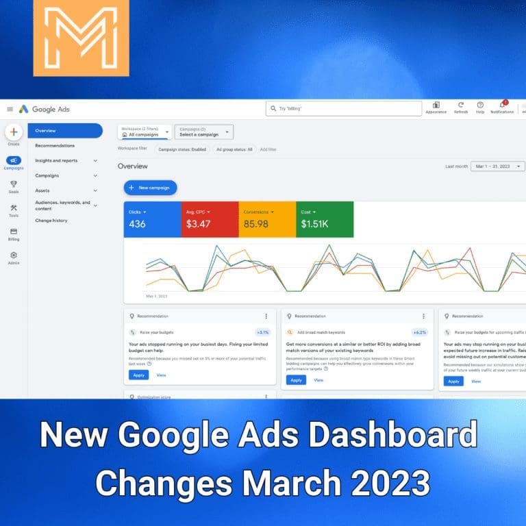
With a new redesign of the Google Ads dashboard, the platform is poised to become even more user-friendly and effective than ever before. In this blog post, we’ll explore the new changes to the Google Ads dashboard and how it can benefit advertisers. From streamlined navigation to new visualization tools, this redesign promises to make managing ad campaigns easier and more efficient. So whether you’re a seasoned advertiser or just starting out, read on to discover the exciting new features of the Google Ads dashboard redesign.
This redesign will be easily noticeable if your account or your clients account gets picked for the change. The immediate difference is they moved all of the settings icons that were on the top of the screen to the left side column.
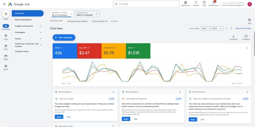
Overview
New Create Button
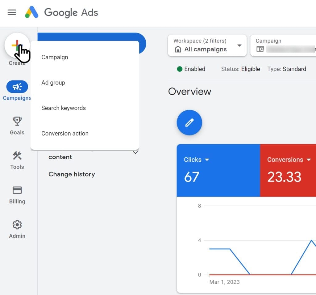
An interesting change is the new create button which has the expected create a new campaign, but you can also create a new ad group, add new keywords, or even new conversion actions directly from that button without needing to navigate to the conversions section or ad group.
Easier Navigation
One nice addition is they cleaned up the view to be standard as you browse into campaigns and ad groups, as the current views when you go too deep you lose the immediate option to quickly change viewing all enabled or enabled and paused campaigns and ad groups as the top section removes those option to show the account spend and information. This new update keeps both options in view at the top even while navigating down to an ad group level.
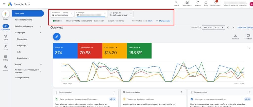
New Campaigns Tab
One of the biggest changes is they moved the reports icon and merged it into the new insights and reports section under campaigns. This section also includes auction insights, search terms, display placements, landing pages, GBP locations, and dashboards.
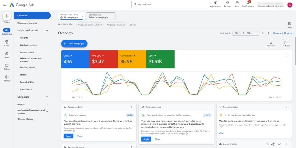
Where Reports Are Hiding
The one that threw me off the most was finding the old reports section as it was its own icon at the top. This is now located under insights and reports in the Reports Editor section.
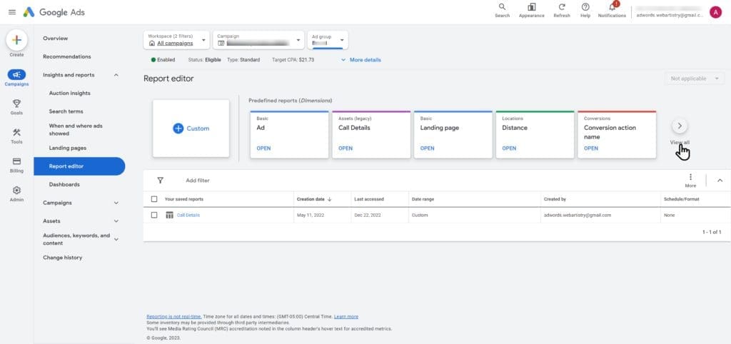
The different reports are now blocks and clicking on the view all will pull up a list of all predefined reports broken out by their main category. There doesn’t seem to be as many as there were in the old predefined reports section, most notably the auction insights had a lot more including campaign, ad group, shopping, etc.
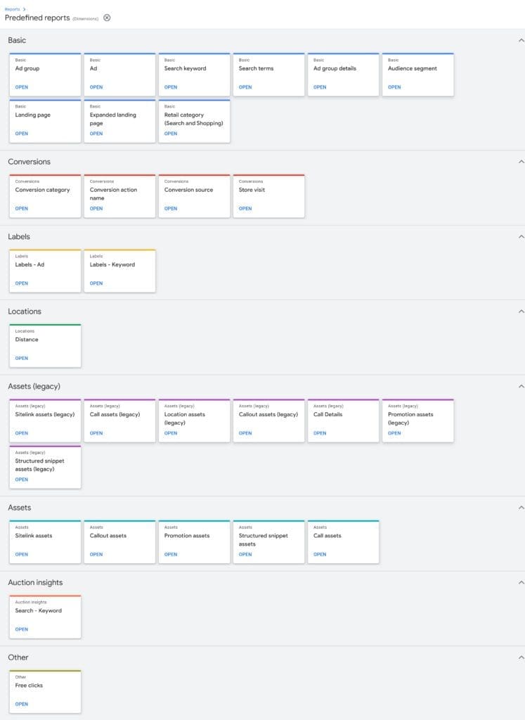
New Goals Tab
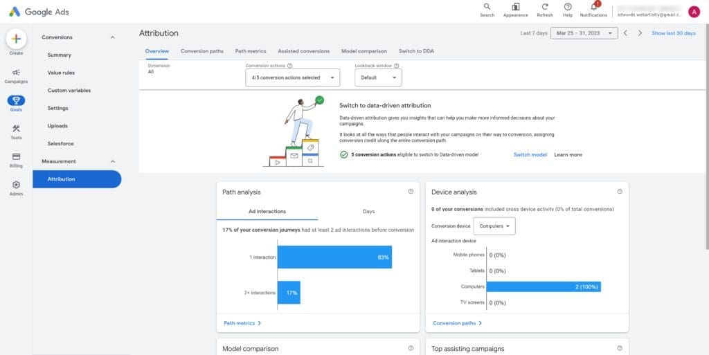
The Goals section is the same which contains your conversions and attributions, though the attributions page seems to have been updated with additional quick access links at the top.
New Tools Tab
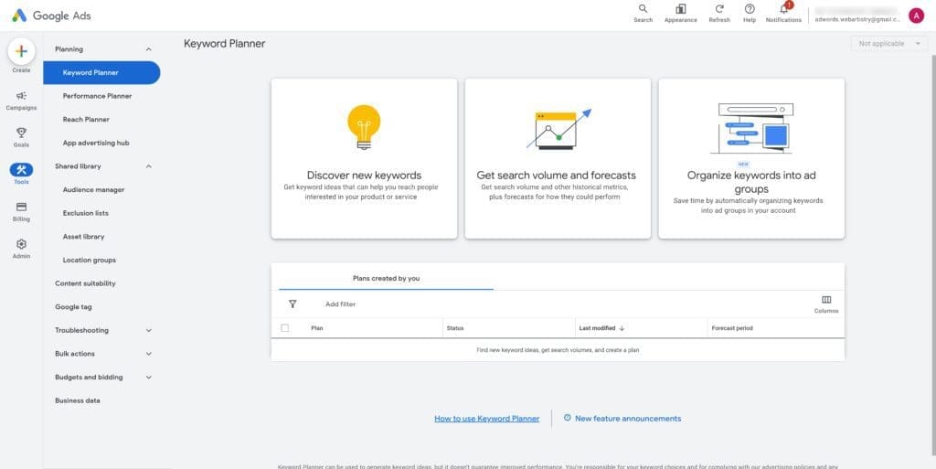
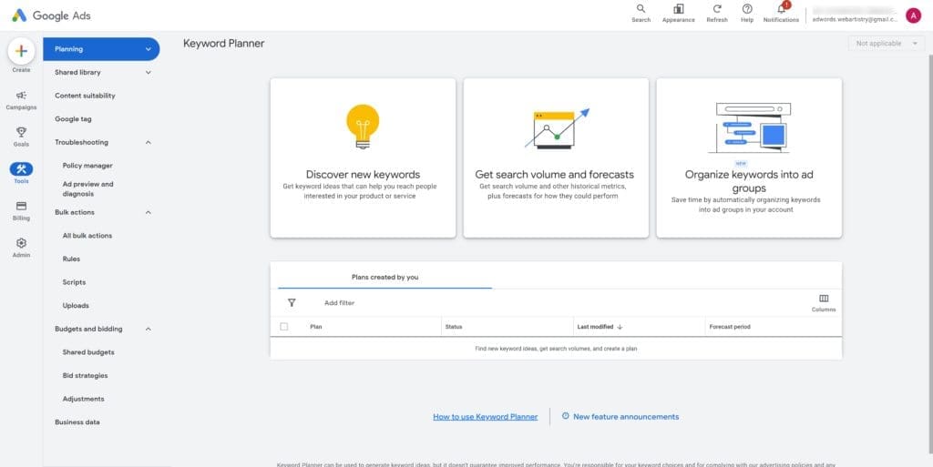
The tools section compiles a lot of different options from the old tools and settings icon. You’ll see the keyword planner, shared library, bulk edits, advertiser verification, budgets and business data are still under this section.
New Billing Tab
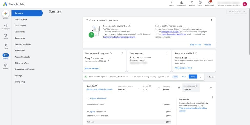
The billing section contains the same as the old billing column in the old tools and settings, but there are additional direct links included in the list.
New Admin Settings Tab
The gear icon Admin section contains a few mroe account level settings, from access and security, to account settings, and linked accounts.
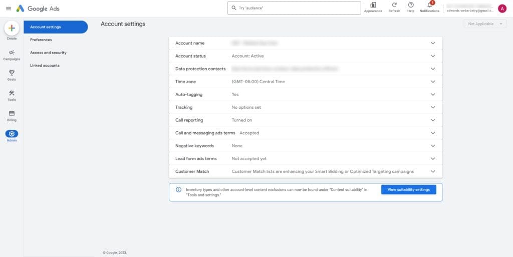
Overall this looks like they’re cleaning up the current dashboard and should help newer users navigate easier. With any major design change this will take a bit for even seasoned ad managers to relearn where everything moved to and will most likely slow them down a bit since we’ve been so used to the current layout.
As we manage a high amount of Google ad accounts every month, we have a lot better chances of noticing new issues, figuring out how best to optimize new campaign types, changes Google made and didn’t notify anyone (including their own support reps), or even getting a US based support rep. If you’re needing help with your Google ads account we can help whether you’re looking for a consultation, having us take over management of your accounts, or if you’re more DIY and interested in changes we’ve found that aren’t usually included in other blog articles
Not sure, or would like to know more about us? Feel free to schedule a call to chat
